Optimising the checkout experience at GetYourGuide
Overview
GetYourGuide is a global travel marketplace for people to discover and book sightseeing tours, tickets for attractions and other experiences around the world.
Around 50% of the users were dropping off at the checkout step on mobile web, after adding an activity to their shopping carts. We decided to spend some time breaking down the problem space and explore solutions to improve the checkout experience and increase the conversion rate.
Role & team
I was the Product Manager of UX & Site Optimisation Team consisting of a UX Designer and a front-end developer.
Timeline
September 2019 - December 2019
My contribution
During my time at GetYourGuide, I was the product manager leading the team responsible of UX optimisations and Growth. I analysed user behavior across the search funnel to identify opportunities to improve user experience and conversion.
I conducted user research and usability testing, analysed the insights, and translated them into product opportunities and experimentation hypotheses together with the designer. After running experiments, I collaborated with our data analyst to interpret the results and shape the next iterations and product decisions.
How might we reduce the drop off rate and decrease the % of errors
on the checkout step to improve conversion rate?
Quantitative insights
I conducted detailed data analysis on the user journey on mobile web, to understand the user behavior better and identify where we should invest our efforts as a team. The data from the search funnel showed that ∼50% of the users were dropping off at the checkout step. We decided to focus on this area for the quarter.

Qualitative insights
To discover the user problems in the checkout step, I conducted user research with 6 users, doing a combination of user interviews and user testing on the checkout. The interviews and tests were done in person, in our office.

Experiments on the checkout
Once we understood the problem space better with looking into quantitative data and qualitative data, we spent time in solution space. We have run a high number of experiments on checkout.
1. Payment methods
Problem / Opportunity
User tests conducted in different domains showed some users were not able to find their preferred payment method on the checkout.
Hypothesis
Adding popular local payment methods on the checkout of the related domains (e.g Sofort on German domain and iDeal on Netherlands domain) will improve Conversion rate (CR).
Results
iDeal Experiment resulted in %4 increase and Sofort Experiment in %3 increase in conversion rate, so we implemented the test variant.

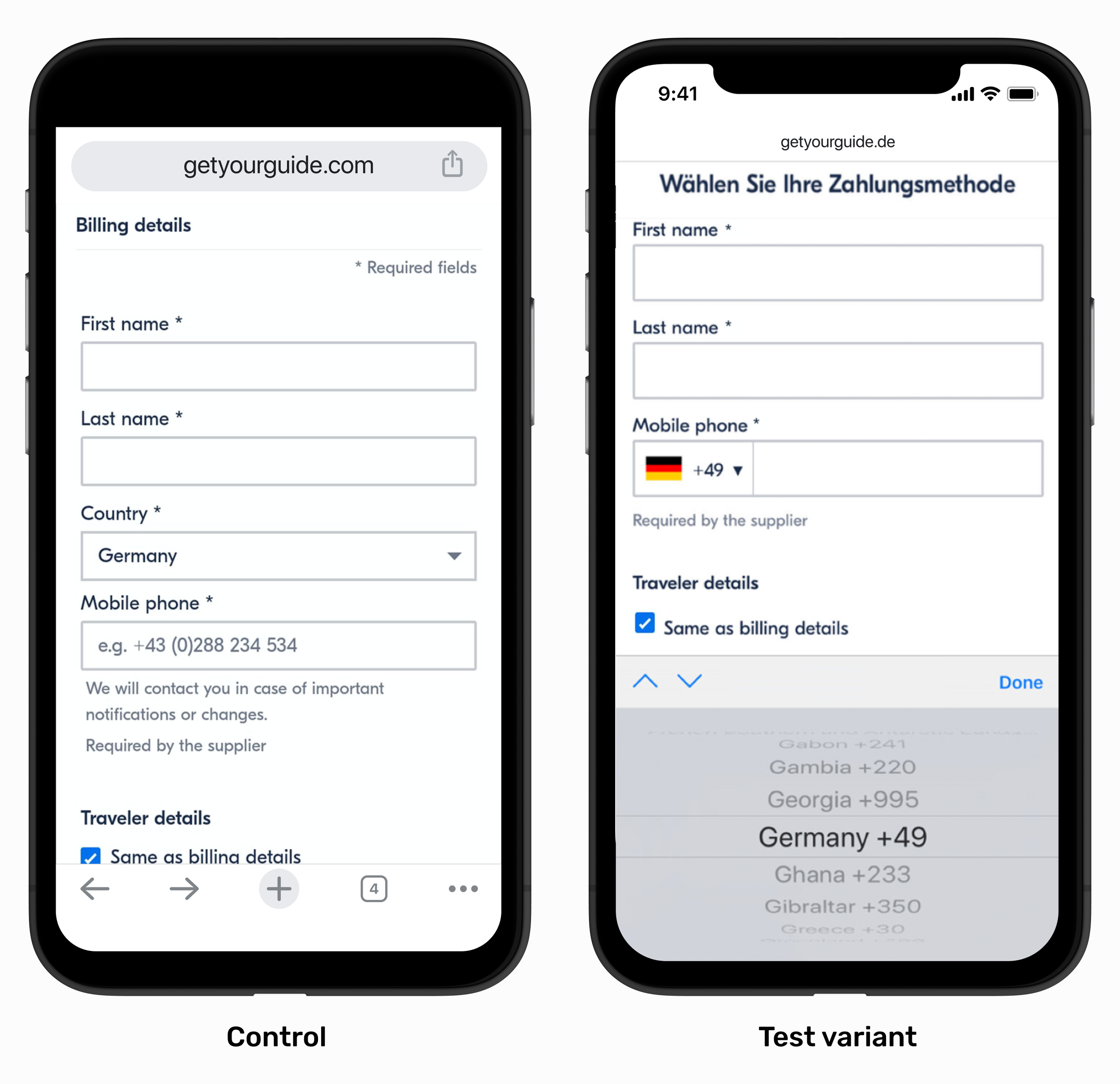
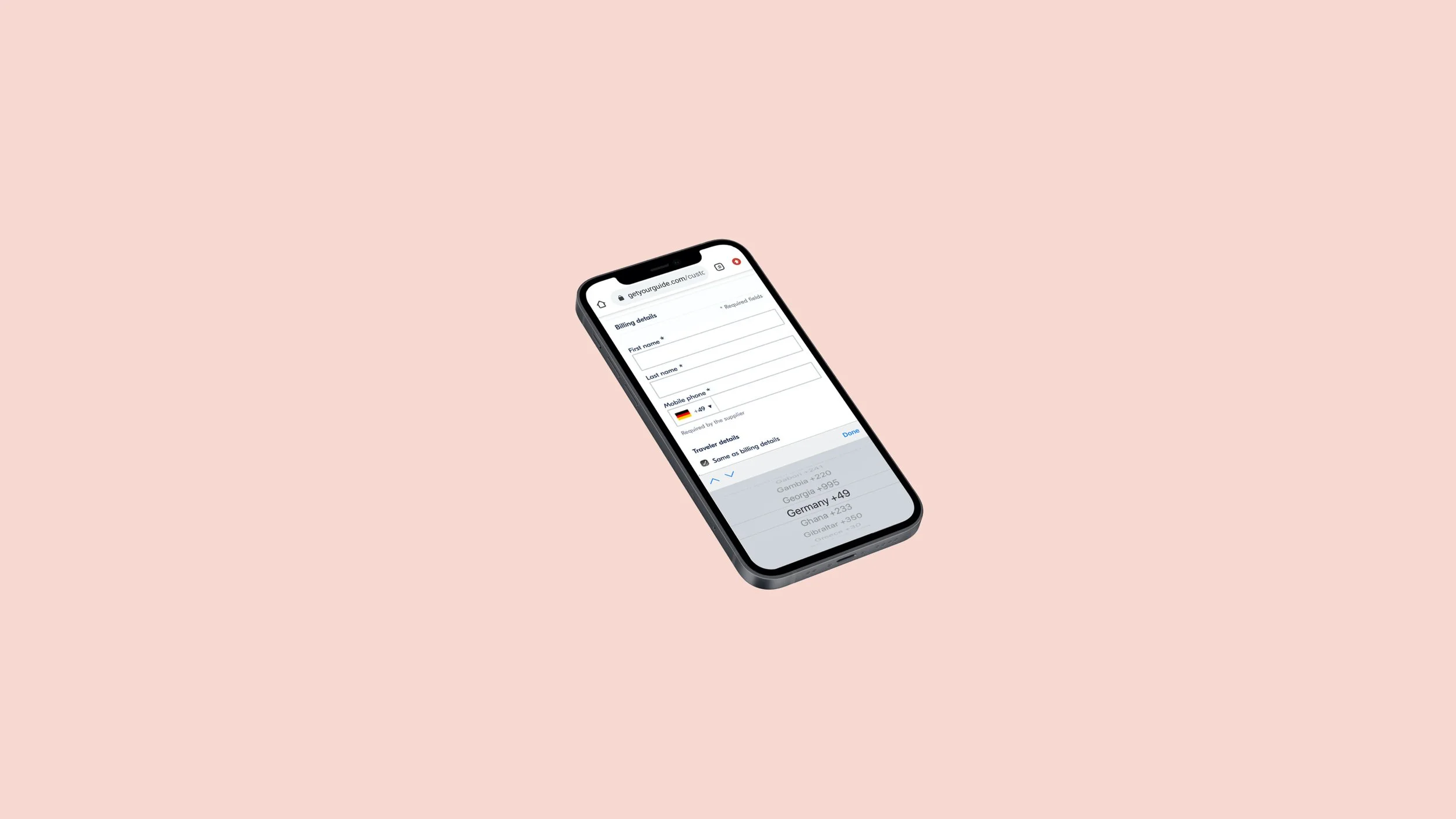
2. Phone field
Problem / Opportunity
User tests showed that users were struggling with the phone field area. The field was empty and most of the users weren’t sure whether they needed to enter a country code or not. Quantitative data analysis showed that there was a high number of errors on this field.
Hypothesis
Creating a dropdown with the related country code and flag will reduce the number of errors and improve the conversion rate.
Results
Flat conversion rate, 65% decrease in the errors on the checkout, we implemented the test variant.
3. Urgency & free cancellation
Problem / Opportunity
User tests showed “Free Cancellation” and “Likely to Sell Out” were the two most popular attributes users were mentioning when choosing and booking their trip. They were included as tags on the card level at the search results page, however were not displayed on the shopping cart step.
Hypothesis
Showing these tags on the shopping cart step will reduce the drop off rate and increase conversion.
Results
5% increase in conversion rate, so we implemented the test variant.


4. Edit shopping cart
Problem / Opportunity
User research showed that users expected to be able to edit their order on the shopping cart step and got frustrated when they couldn’t.
Hypothesis
We may improve conversion rate by making it easy for the users to edit their orders on the cart step.
Results
Flat conversion rate, however 50% of users clicking on “Edit” on this step and 20% increase in click through rate from checkout to payment steps. We implemented the test variant.
Below is a visualisation of the user flow and the results of the edit cart experiment. The user flow starts from Activity details page (ADP) and ends with the last step: payment.

Learnings & next steps
Adding “Free Cancellation” and “Likely to Sell Out” tags at the shopping cart step led to a significant increase in conversion rates, highlighting the potential for further experimentation with these tags. As a next step, we expanded these experiments to the Activity Details Page and other funnel touch points.
Allowing users to pay through a variety of payment methods led to a substantial increase in conversion rates. So we continued testing additional popular payment options across different country domains and consistently observed significant uplifts.
Reflections
This project shaped how I think about product design and experimentation. Through hands-on user research and iterative testing, I learned how directly observing user behavior can uncover usability issues, influence prioritization, and guide product decisions.
I especially enjoyed being close to users through conducting interviews, running usability tests, and translating research insights into product improvements. That experience played a key role in my decision to transition into Product Design.
< Previous
© Esin Ozcan 2026