
Understanding comparison behavior at mobile.de
Overview
mobile.de is Germany's largest online vehicle marketplace. Users can save vehicles to the Car Park (favorites section), where comparison is one of the core jobs-to-be-done (JTBD).
We wanted to better understand how users compare cars across the search journey, with a particular focus on the Car Park experience, and identify opportunities to improve comparison across desktop and mobile.
Role & team
I was the Product Designer of the Save Space team which belonged to the Finding Squad. The team consisted of a product manager, two Android developers, two iOS developers, two Front-End developers, a backend developer and a Tech Lead.
Timeline
Jan 2024 - Mar 2024
My contribution
As we didn’t have a dedicated UX researcher, I led the end-to-end study in collaboration with our newly hired UX Research Lead. Together with the PM, I defined the research goals and interview structure, recruited participants through Rapid User Testing, moderated the sessions, and synthesized the findings. I then shared the insights with stakeholders, facilitated ideation workshops, and translated the research outcomes into product opportunities and solution directions.
The first two experiments informed by this research
increased contact rates in the Car Park by 10%
and overall contact rates by 5%.
The goals
I worked closely with my PM and UX Researcher to establish the goals of the research to understand:
What users find helpful and struggle with during the current comparing experience on mobile.de and specifically on the Car Park (favorites).
How users currently compare:
Which criteria such as vehicle details, dealer information, and price are most important to users when searching for a car and why.
Once users narrow down the cars that seem most interesting, how do they further narrow down the list and eventually identify the car they get in touch about.
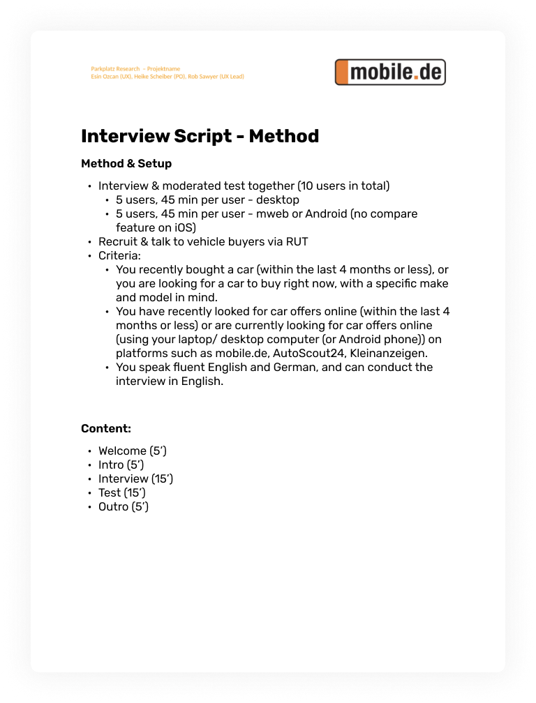
Participant screening
We recruited 5 desktop and 5 Android users to explore similarities and differences in the comparison experience across platforms. Participants had recently bought or searched for a car online on platforms such as mobile.de, AutoScout24, or Kleinanzeigen.
Structure of the study
The study was online and moderated by me using a tool called Rapid User Tests. It was structured to include a user interview and usability test.
1. User Interviews
Why?
To understand which criteria (like vehicle details, dealer info, payment options like leasing or online buying etc) are most relevant while searching for a vehicle and why.
How?
By asking users how they usually find a vehicle they like and contact the seller.
2. Usability Test
Why?
To understand how users compare: what is helping them and what makes it hard for them to compare while searching on mobile.de and specifically on the Car Park.
How?
By setting a scenario and observing users to carry out specific tasks while talking out loud.
Analysis process
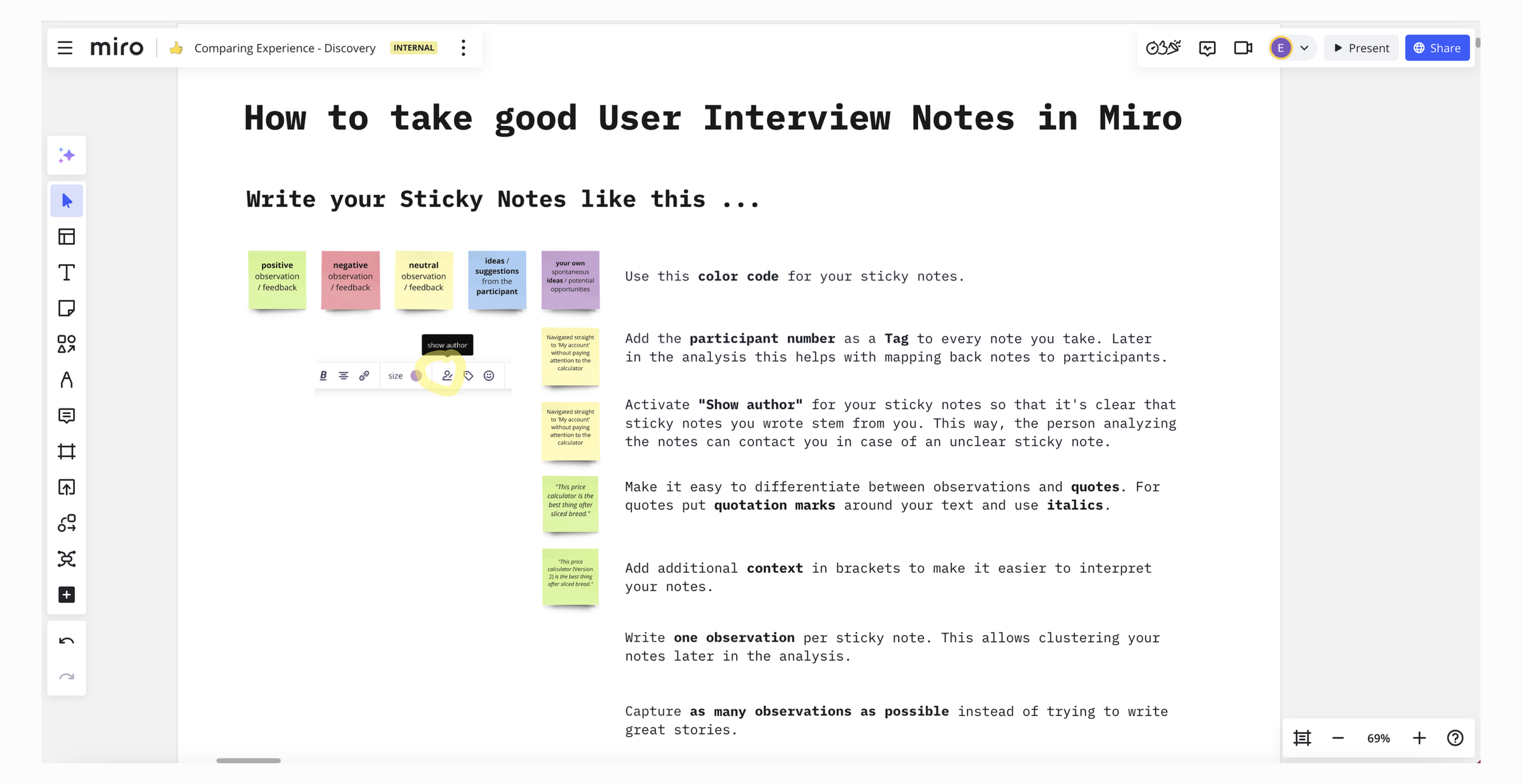
1. Note taking
To document the insights, I used notes on Miro, using color code for the sticky notes (red: negative observation/pain points, green: positive observation/user driver, yellow: neutral observation, blue: ideas/suggestions from the participant). Notes were tagged according to the participant order (P1, P2, P3..).
I invited the product manager and developers of my team to join the research sessions. Everyone who joined took notes using sticky notes, following the guideline I developed in collaboration with the UX Research Lead. This helped the team members to gain a deep understanding of the user problems.
2. Mapping the pain points
I mapped the pain points, user drivers, neutral observations and ideas per participant, per each step of the search journey, like the vehicle info step and the Car Park (“Parkplatz” in German, favorites) step.
We now had pain points and drivers mapped per each step per participant, across the whole search journey: from the Homepage to detailed search, search results page, vehicle info page, Car Park, and finally, the comparison page.
I conducted this mapping exercise for each participant on both desktop and Android. This helped reveal how comparison behaviors differed between desktop and Android across the journey.
3. Clustering insights
I clustered all pain points and drivers of all the 5 participants, per each step of the search journey, like the vehicle info step and the Car Park (parkplatz) step, per platform.
With all the pain points and user drivers clustered from all participants per each step, I proceeded to map them to a 4 quadrant matrix, where we can visually clearly see the "User pains” (red), “User drivers” (green),” Ideas & suggestions by users” (blue) and “Neutral observation / feedback” (yellow).
Below, the matrix for the comparing experience on the Car Park (parkplatz) step on desktop can be seen.
With all the insights clustered together, we now had a matrix of main user pain points and drivers at each step of the search journey: Homepage, detailed search, search results page, vehicle info page, Car Park and comparison feature page, for both desktop and Android.
Key insights
After I completed the analysis , I summarised the key findings of each step per platform and shared these key insights with the stakeholders of the relevant teams who owned these artefacts. The findings between desktop and Android were mostly similar.
Search Results Page - Pain Points
Price rating tag is helpful for the users to compare, however how it is calculated is not clear.
Sorting options help to compare the results, however the default value of "Standard sorting" is unclear.
Not being able to see extra equipment from this view makes the comparison harder.-
Vehicle Info Page - Pain Points
Missing data about the car around the description is the key pain point while comparing.
Forgetting which equipment was included in the page previously looked included makes it hard to compare.
"Vehicle Description by dealer" section is hard to read and negatively impacts the comparison experience.
Car Park - Pain Points
The absence of tech specs (mileage, horsepower, etc.) on the parked vehicle makes comparison difficult, as users have to open the vehicle info page to see them.
Price rating tag is helpful for the users to compare, however how it is calculated is not clear.
“Compare” checkbox is not seen by most users and they don’t know this functionality exists.
Comparison Page - Pain Points
Most users find it difficult to spot the differences of the compared data at a glance. Some expect visual cues to highlight those differences.
The absence of data values and the resulting empty cells make it difficult to compare information.
Users find it hard to understand the current order of the data on this page and expect to see a different order.
Ideation
After sharing the insights I facilitated two ideation sessions with my team on our artefact Car Park and with the stakeholders on the others. Together, we brainstormed ways to address the pain points identified during the research.
The challenge we tackled was: “How might we enhance comparison across key steps of the search journey (Search Results page, Vehicle Info page, Car Park page, etc.)?” After gathering all the ideas, we used dot-voting to prioritise the ones we believed have the highest potential impact in solving the pain points.
Next steps
The research insights and ideas from the ideation session were used to build a backlog for my team, with the most dot-voted ones prioritised.
We ran two experiments from these ideas already, to improve the comparing experience on the Car Park.
Upcoming experiments are prioritised and will be run as possible iterations based on the results of the previous experiments.
Next >
< Previous
© Esin Ozcan 2026