
Redesigning the favorites section at mobile.de
Overview
mobile.de is Germany's largest online vehicle marketplace. Despite the high intent of users saving vehicles to the Car Park (favorites section), only around 20% contacted sellers. While the team had already implemented multiple micro-optimizations over time, the experience had reached a local maximum.
Instead of continuing incremental improvements, we decided to redesign the Car Park experience more fundamentally to establish a stronger baseline for future experimentation and optimization.
Role & team
I was the Product Designer of the Save Space team which belonged to the Finding Squad. The team consisted of a product manager, two Android developers, two iOS developers, two Front-End developers, a backend developer and a Tech Lead.
Timeline
May 2023 - Feb 2024
My contribution
I initiated this project after analyzing the search funnel and identifying an opportunity to improve the Car Park (favorites section) contact rate. After sharing my findings, our product manager and I aligned on a redesign initiative.
I collaborated with our product manager on defining goals and hypotheses, led ideation sessions, conducted user research, and designed smaller experiments. Finally, I integrated key learnings from these into the redesign experiment.
Quantitative discovery
Quantitative analysis revealed that the Car Park (favorites section) had strong potential for both user and business impact.
Users who saved a vehicle to the Car Park had 4–8x higher seller contact rates compared to users who did not save vehicles.
Despite this high intent, only around 20% of Car Park users contacted sellers, revealing a major opportunity for improvement.
Qualitative discovery
I conducted exploratory research and moderated usability tests on the existing Car Park experience to understand how users interacted with saved vehicles and where friction occurred in the comparison and contact journey. The research showed that users primarily used the Car Park to save, compare, and contact sellers.
The findings helped identify key user drivers, pain points, and opportunities that directly informed the redesign direction.
Ideation
I facilitated an ideation workshop with the team focused on improving Car Park’s contact rate. Together, we explored and dot-voted on the ideas with the highest potential impact.
We then mapped the ideas to an impact-effort matrix. I integrated some of the low effort-high impact ones to the Car Park redesign and some of them went to our backlog as possible iterations after it.
Small experiments along the way
Before the full redesign, we tested smaller changes on the Car Park individually to understand their impact. Here are some examples:
Primary CTA order change from left to right on mobile web: Increased contact rate by 10%, so we kept the CTA on the right in the redesign.
Opening saved vehicle page in a new tab on desktop: Increased contact rate significantly by 4% so we kept this behaviour in the redesign.
Reducing number of technical specs from 8 to 4: Had no negative impact, we maintained this change in the redesign.
Creating a vision
To define a vision for the Car Park, we started with a core question: What should the primary role of the Car Park be?
List: A compact overview focused on helping users quickly scan, compare, and navigate to vehicle detail pages.
Grid (Listing): A richer visual overview with larger images and additional seller information.
Concept testing
We tested List and Grid/Card concepts with desktop and iOS users. Research showed that both the List and Grid versions provided value to users, so we moved forward with A/B testing both layouts on desktop and iOS.
Desktop Insights
Users preferred the Grid layout on desktop.
Larger images and additional seller information reduced the need to open the Vehicle Info Page.
The layout also felt more visually engaging and emotionally appealing.
iOS Insights
Users preferred the List layout on mobile.
Seeing more vehicles in the viewport made comparison easier.
Reduced scrolling improved quick scanning and decision-making.
Redesign experiment
We combined research insights, previous A/B test learnings, and internal explorations into a broader redesign experiment for Car Park.
Experiment Goal
Determine whether larger images and more seller information would improve engagement and seller contact rates.

Variants
Control: Existing Car Park experience
Variant A - List: More vehicles visible with compact information density
Variant B - Card: Larger images and more seller information
The List version drove a 2% uplift in comparisons
and a 3% uplift in users contacting sellers.
While the Card view provided larger images and more seller information, the compact List layout enabled faster scanning and easier comparison across multiple vehicles.

Iteration: Allowing users to switch between views
With the List version winning, we killed the old Car Park and planned its rollout. However, the Grid version, despite flat contact rates in the experiment, was well-received in user research, especially on desktop.
Recognising the value of qualitative insights, we chose to keep both views, allowing users to switch between them and select their preferred layout.

As a follow-up to the redesign experiment, we tested two default views (List vs Grid) to determine which layout should become the default, while still allowing users to switch between them. The old Car Park was no longer included as a variant.
We introduced a one-time popover to explain the new layout switch, shown only on users’ first visit to the redesigned Car Park.
The List view as the default outperformed the Grid view with
a 6% uplift in users contacting sellers and a 4% uplift in engagement.
We then brought the redesign to iOS, testing how different layouts impacted comparison and seller contact behavior on mobile.
Variants
Control: Existing Car Park experience
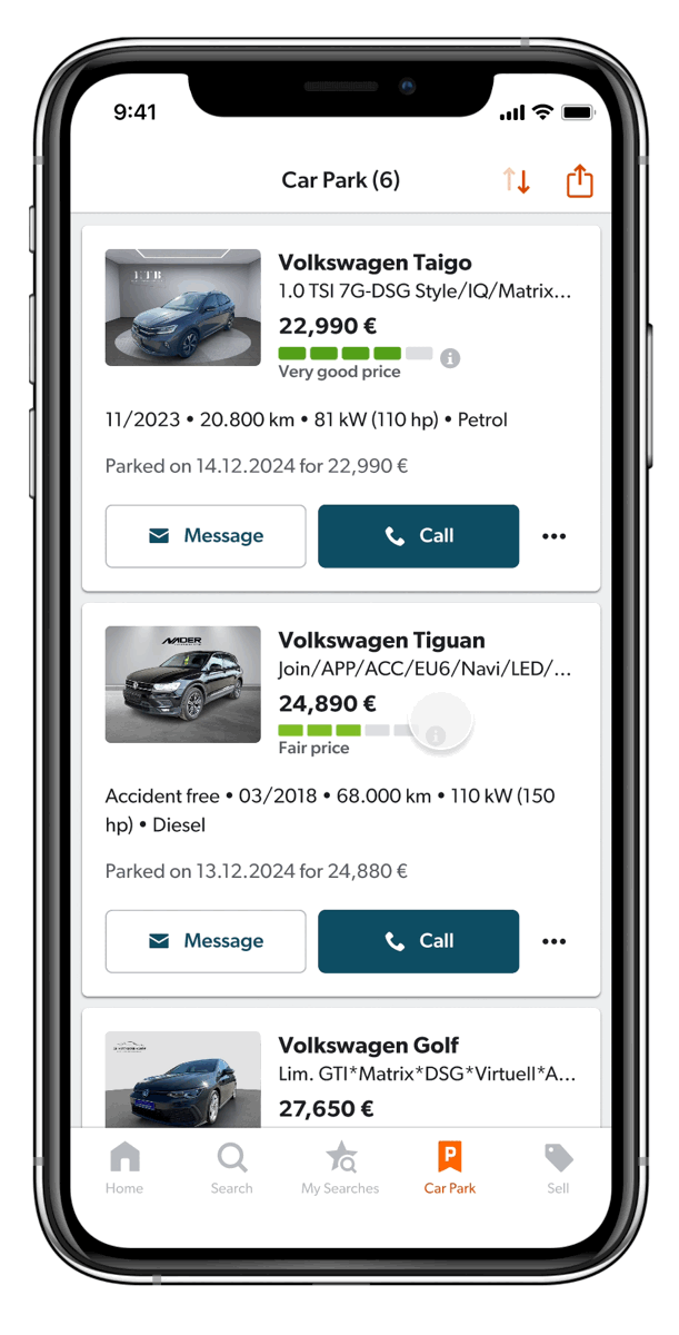
Variant A — List: Higher information density with more vehicles visible in the viewport
Variant B — Card: Larger imagery and more seller information
Key Insights
Both variations gave us significant uplifts compared to production / control Car Park. The winner was the List version.
The results validated insights from the earlier concept tests: users preferred seeing more vehicles in the viewport over larger images with fewer visible listings. With less need to scroll, scanning and comparing vehicles became faster and easier on mobile.
Comparison is a key jobs-to-be-done (JTBD) on the Car Park and the List version improved the comparison experience on mobile devices. We rolled out the List version on iOS, creating consistency between the web and iOS Car Park experiences, where the List layout emerged as the preferred view on both platforms.
Setting the List view as the default on iOS increased users
contacting sellers by 3.9%, engagement within the Car Park
by 9%, and total contacts from the Car Park by 60%.
Next steps
We’re currently implementing the winner variant from the iOS experiment on Android, to keep consistency across the platforms.
We established a new base level with the redesigned Car Park, which we’ll optimise further with upcoming research insights.
© Esin Ozcan 2026